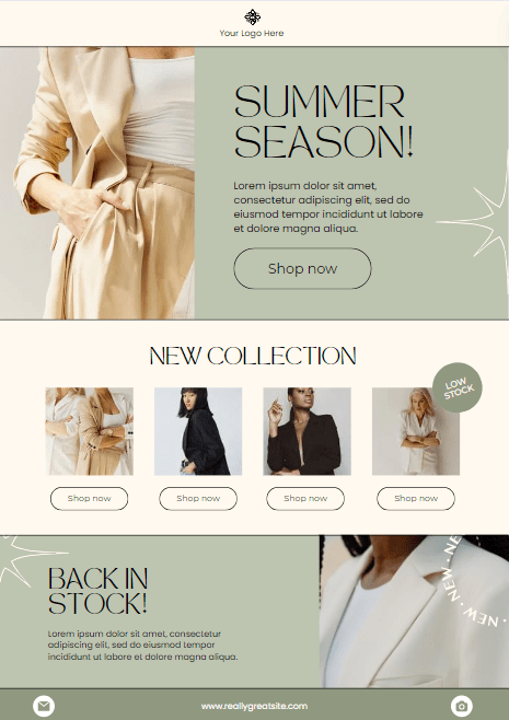
Creating a newsletter can be a bit of an art form. From balancing engaging content with eye-catching visuals to ensuring it’s easy to read and flows well, there’s a lot to consider. You might be tempted to simplify things by using a single image block for your newsletter. I get it – it’s quick, easy, and visually striking. But hold on! Before you hit send, let’s dive into why this approach might not be the best choice and explore some better alternatives.
The Allure of the Single Image Block
Using a single image block can be appealing for several reasons:
- Visual Impact: A large, beautiful image can immediately grab attention and set the tone.
- Simplicity: It’s a straightforward way to design your newsletter without getting bogged down in formatting text and images separately.
- Consistency: Keeping the look of your newsletters consistent can help with brand recognition.

But despite these benefits, there are a few significant downsides to consider.
The Pitfalls of Relying on a Single Image Block
- Loading Issues: Not everyone has a high-speed internet connection, and large image files can take time to load. If your image doesn’t load quickly, readers might not wait around.
- Accessibility: People who use screen readers or have visual impairments may struggle with a newsletter that’s just one big image. Text within images isn’t easily readable by assistive technologies.
- Engagement: A single image might look great, but it doesn’t invite interaction. Text allows for links, bold statements, and calls to action that can drive engagement.
- SEO and Analytics: Text is critical for search engine optimization (SEO) and tracking user engagement. An all-image newsletter doesn’t provide much data on what parts of your content are most interesting to your readers.
Better Alternatives for a Well-Rounded Newsletter
To make your newsletter both visually appealing and functional, consider these tips:
1. Use a Balanced Layout
Combine text and images to create a visually appealing layout. Break up your content into sections with headers, images, and short paragraphs. This makes it easy to scan and read.
2. Optimize Images for Web
Ensure your images are optimized for fast loading without sacrificing quality. Tools like TinyPNG can help compress images without losing clarity.
3. Include Alt Text
Always add alt text to your images. This not only helps with accessibility but also improves your SEO. Describe the image in a way that conveys its content and purpose.
4. Interactive Elements
Incorporate interactive elements like buttons, links, and social media icons. These encourage readers to engage with your content and take further action.
5. Consistent Branding
Maintain a consistent color scheme, font style, and tone across your newsletters. This helps reinforce your brand identity while keeping your content professional and cohesive.
A Quick Example
Let’s say you’re promoting a new event in Niagara. Instead of one large image of the event flyer, break it down:
- Header Image: A smaller banner image at the top with the event name and date.
- Text Block: A short paragraph introducing the event and its highlights.
- Image with Alt Text: A picture of the venue or previous events with a description.
- Call to Action: A button linking to the event registration page.
- Social Links: Icons linking to your social media pages.
This approach makes your newsletter more accessible, engaging, and informative.
While a single image block might seem like a tempting shortcut, it’s worth taking the extra time to create a well-rounded, balanced newsletter. Your readers will appreciate the effort, and you’ll likely see better engagement as a result. Remember, it’s not just about looking good – it’s about communicating effectively.
So, next time you’re crafting your newsletter, think beyond the single image block and aim for a mix of text, images, and interactive elements. Your readers (and your analytics) will thank you!
Your message has been sent
Hashtags vs. Keywords: What Matters More for Social Media in 2025
Okay, let’s talk about something that’s been confusing a lot of business owners lately: hashtags and keywords. Remember when hashtags were everything? You’d toss in #smallbusiness or #supportlocal and hope your post took off? Well, things have changed a bit. Hashtags still matter, but they’re not running the show anymore. Platforms like Instagram, TikTok, and…
What Your Instagram Bio Should Look Like (And Why It Matters)
Your Instagram bio is one of the most underrated parts of your social media strategy.It’s small but powerful, and it can be the difference between someone clicking “follow” or moving on. Think of your bio as a mini sales page. In just a few seconds, it should tell people who you are, what you do,…
Real vs. Reel: What Actually Matters on Social Media
It’s easy to get caught up in what we think we need to succeed on social media.More followers. More likes. The perfect aesthetic grid. But here’s the truth: none of those things alone will grow your business in a meaningful or sustainable way. What You Think You Need vs. What Actually Matters Social media is…


Leave a comment